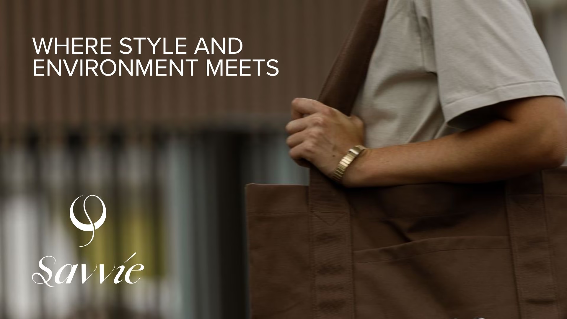
When we started working on Savvié, we wanted it to feel like a brand people could trust from the very first look. The products are simple by nature—reusable bags made from natural fibres—but the experience shouldn’t feel ordinary. Whether someone picks one up at a local café, receives it as part of a gift, or carries it home after shopping, it should feel thoughtfully made and worth using again.
The Hear from the founder:
Building the Identity
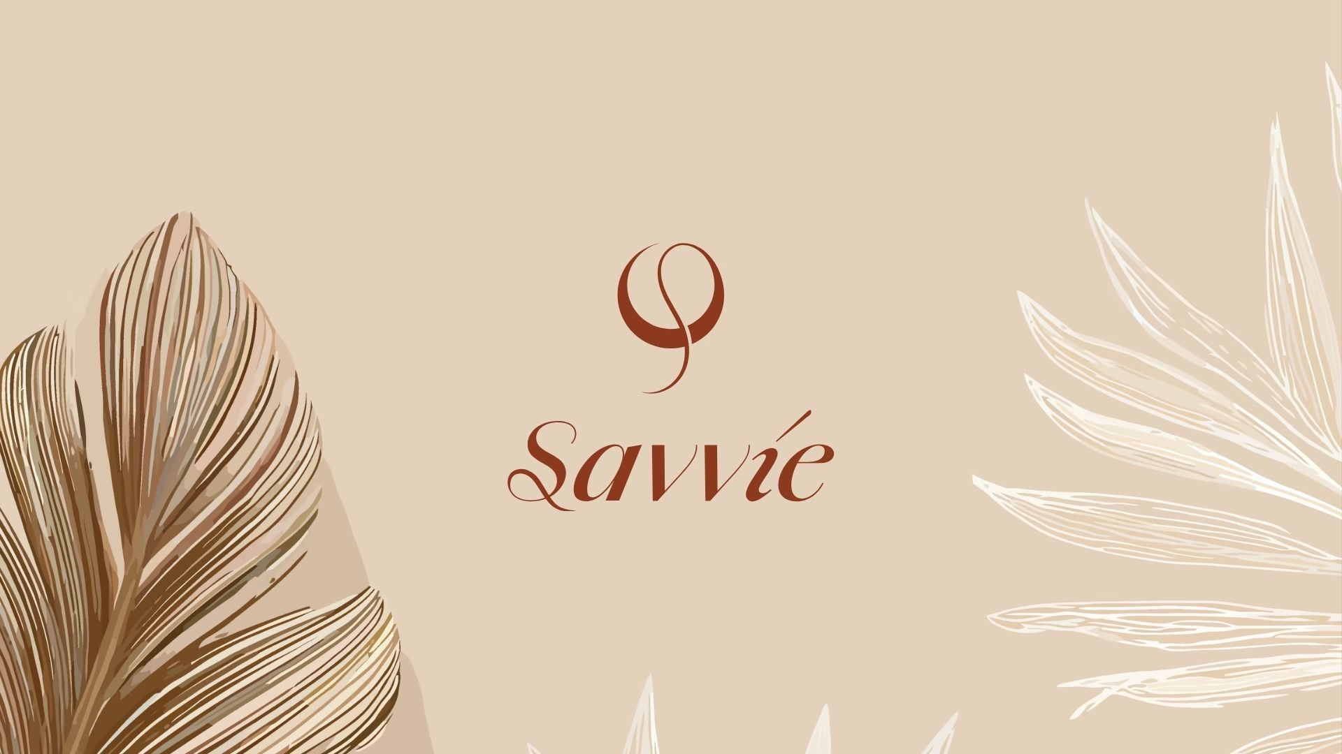
We wanted the identity to feel calm, natural, and timeless.
The colour palette takes its inspiration from nature. Burnt Umber adds warmth, Olive Gold reflects the natural fibres used in the products, and Charcoal Black gives the brand structure and confidence. Cream Beige, Dusty Rose, and Ivory White soften the palette, making everything feel approachable and handcrafted rather than industrial.
For typography, we paired Amandine with Proxima Nova. Amandine brings elegance and personality to the brand, while Proxima Nova keeps everything clean, modern, and easy to read. Together, they create a balance between craftsmanship and professionalism.
The Logo
We wanted the logo to have meaning without relying on obvious eco-friendly symbols.
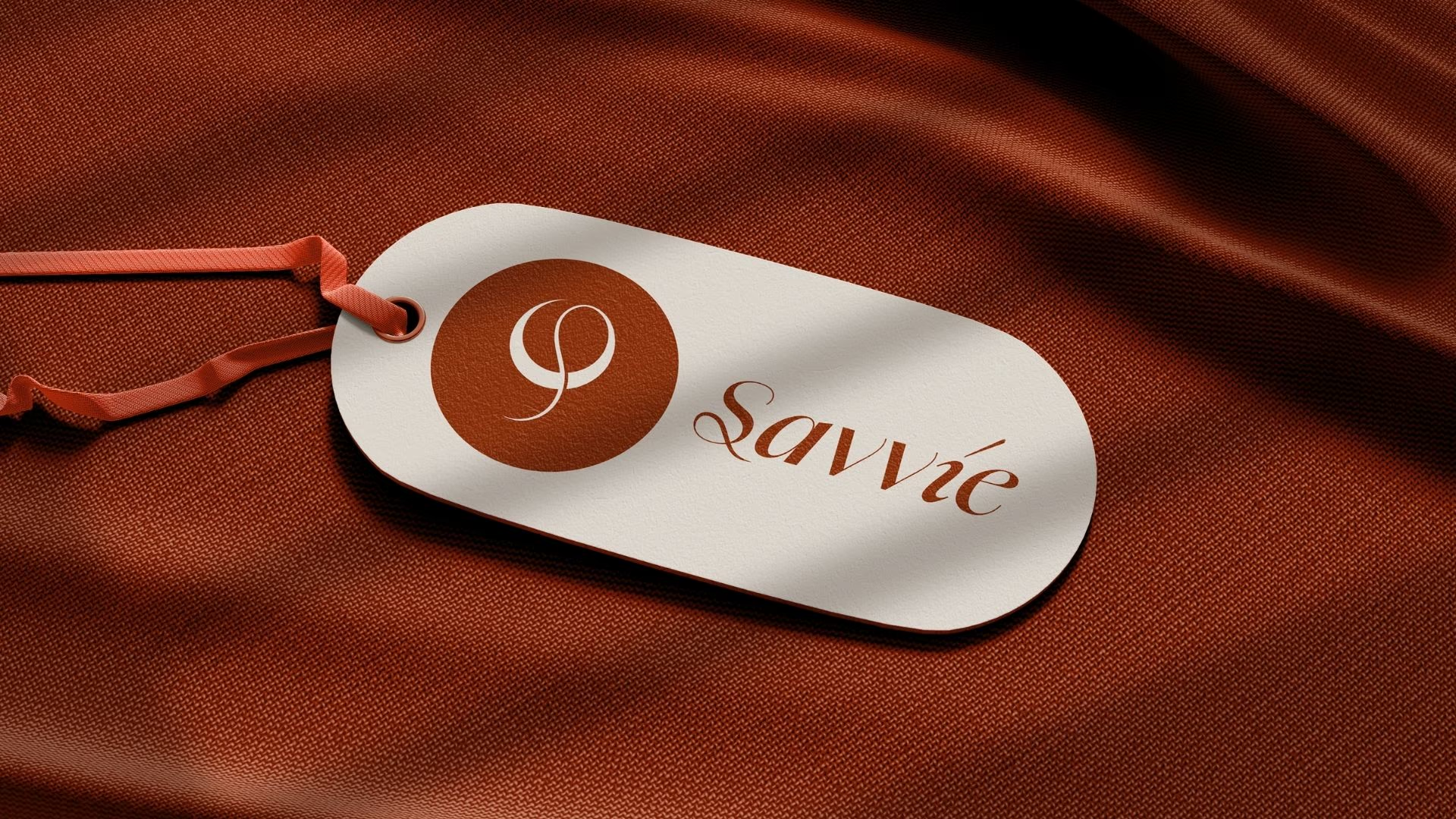
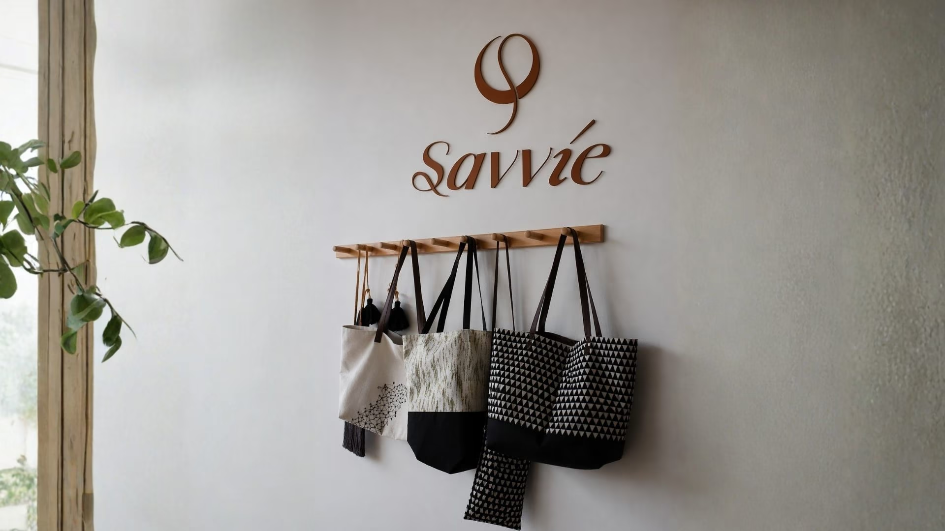
The symbol takes inspiration from phi (Φ), the Greek letter closely associated with the golden ratio—a principle known for balance, harmony, and timeless design. It also connects back to the products themselves. Many of Savvié’s bags are made using natural golden fibres, so the idea of “golden” became a subtle thread throughout the identity.
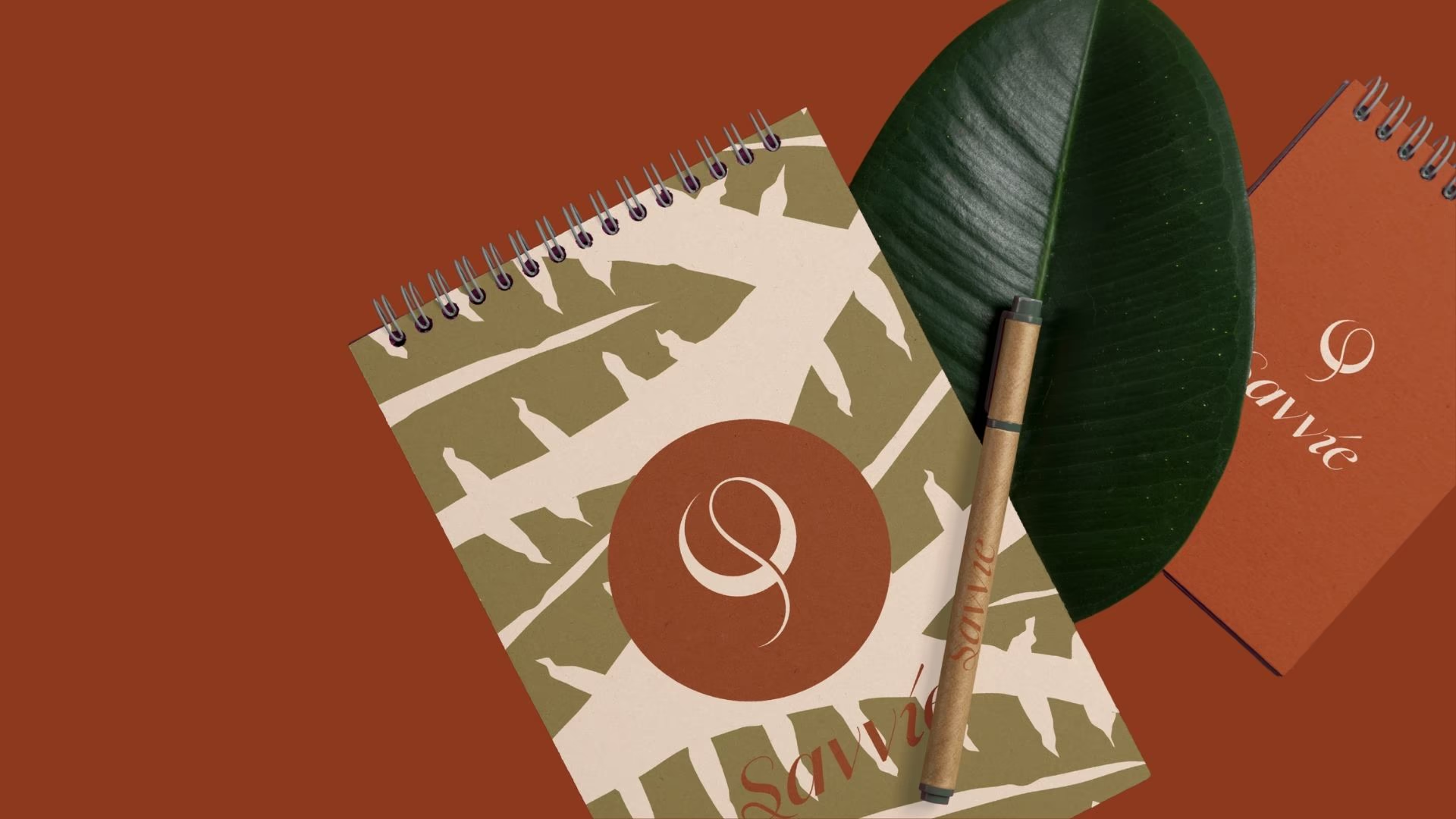
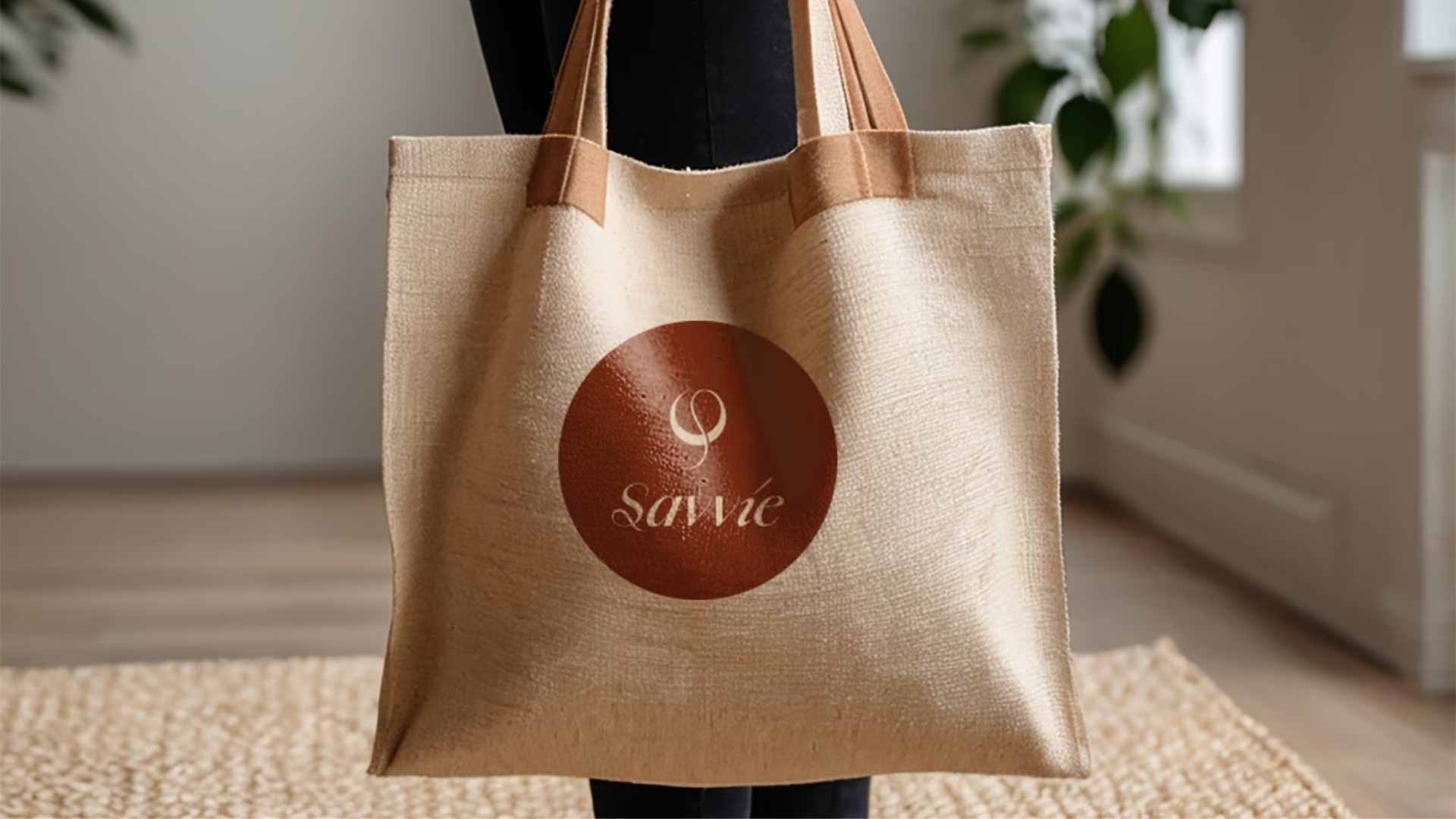
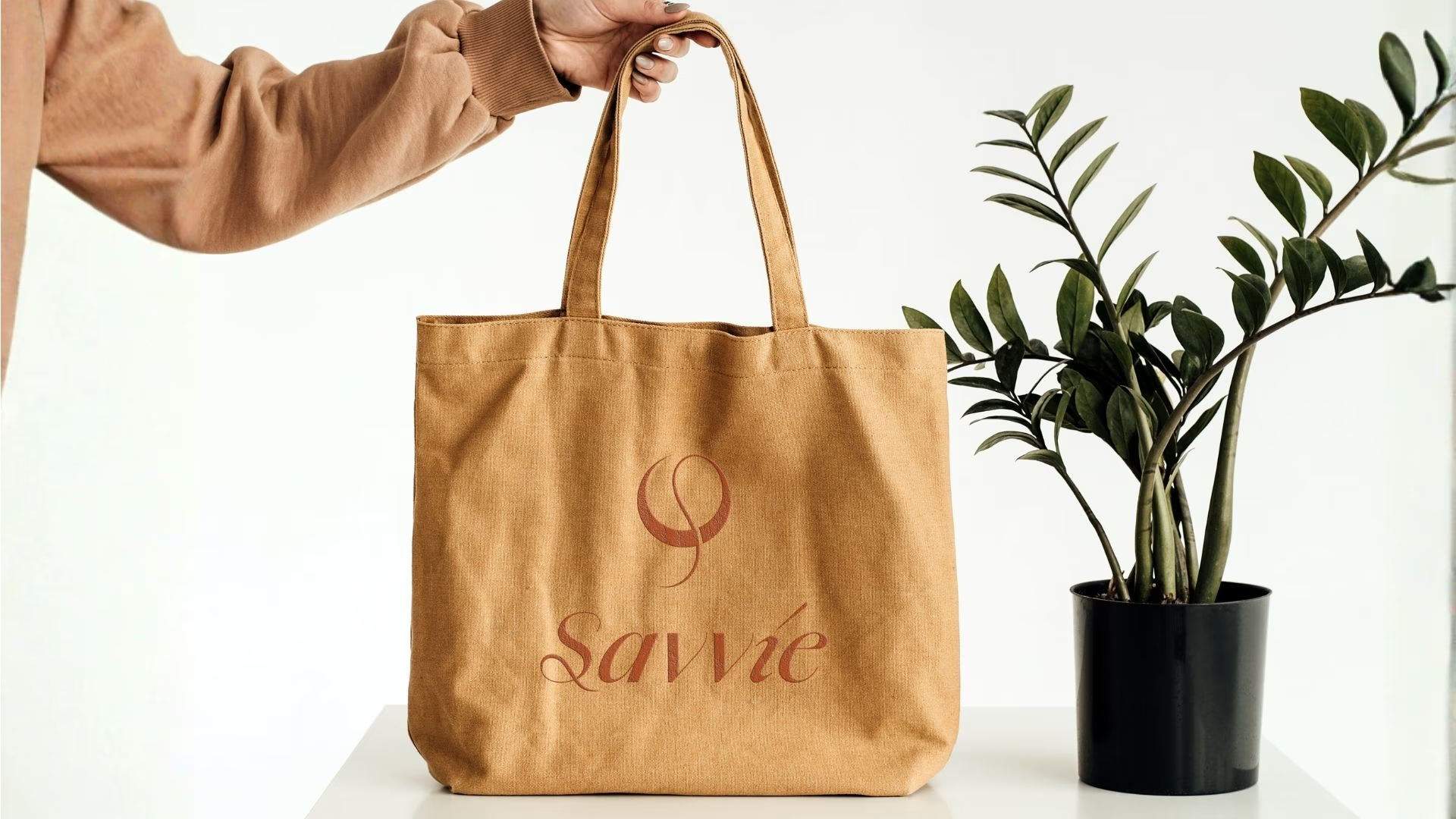
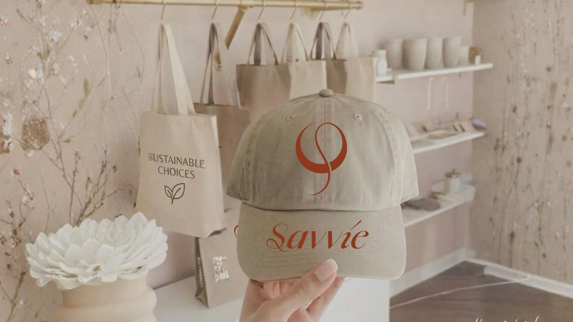
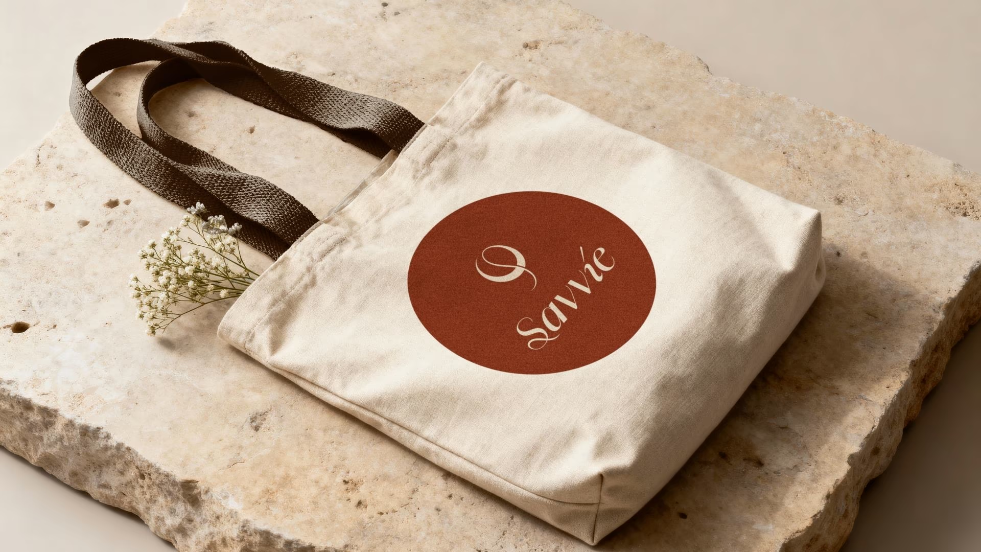
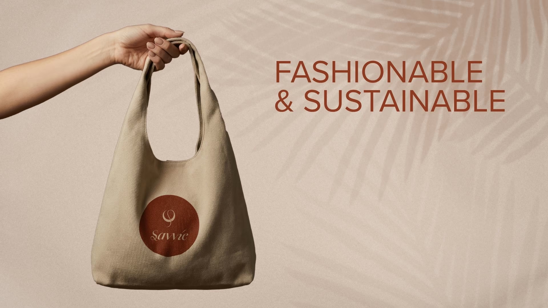
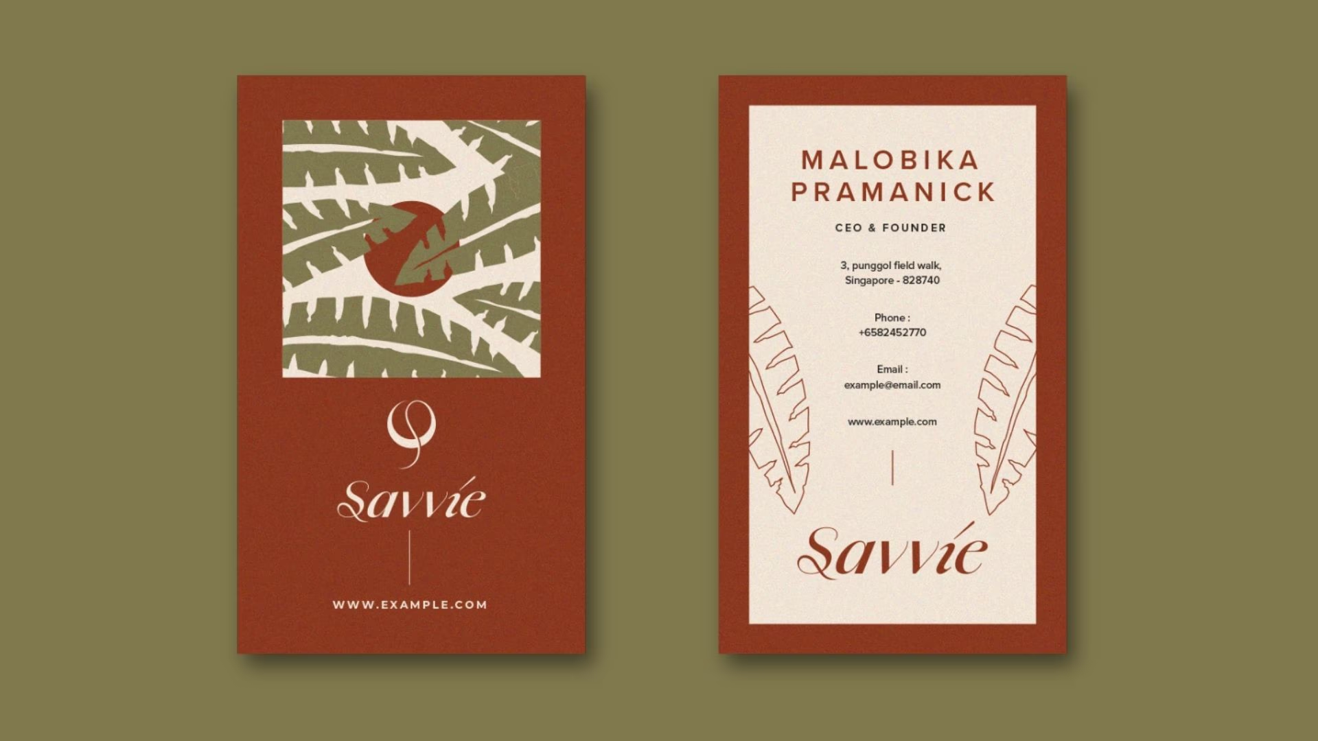
Instead of using leaves or recycling icons, we chose a cleaner, more timeless symbol that gives the brand its own personality. It works just as well on a product tag, a tote bag, packaging, or a business card.
Paired with the elegant wordmark, the logo feels refined, memorable, and built to last.
Bringing Everything Together
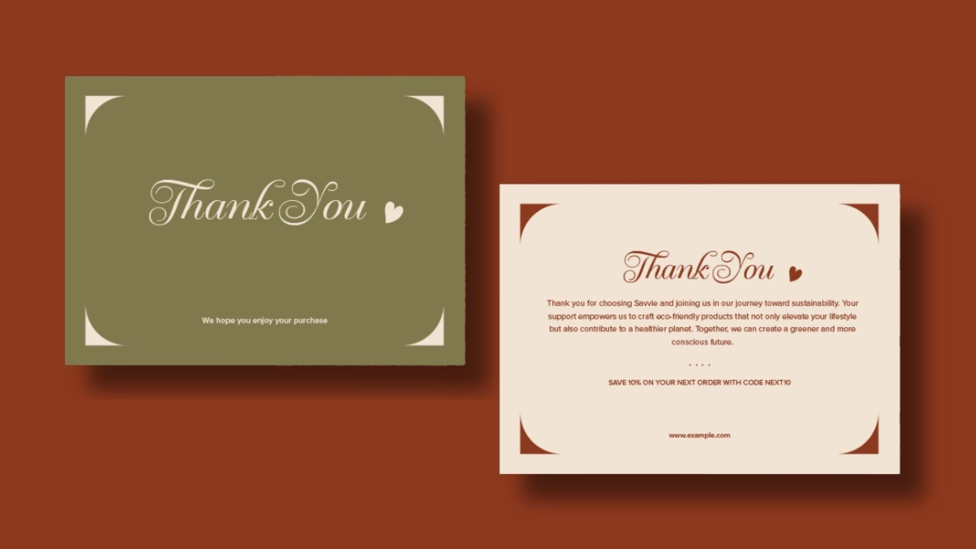
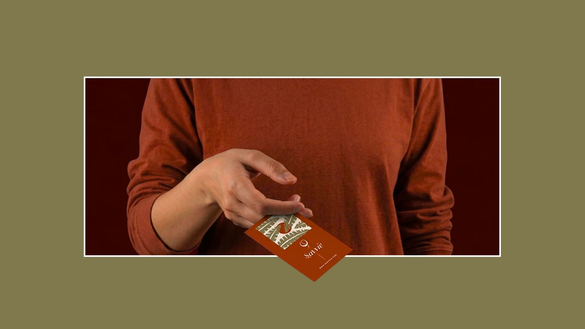
Once the identity was in place, we carried the same thinking across every touchpoint.
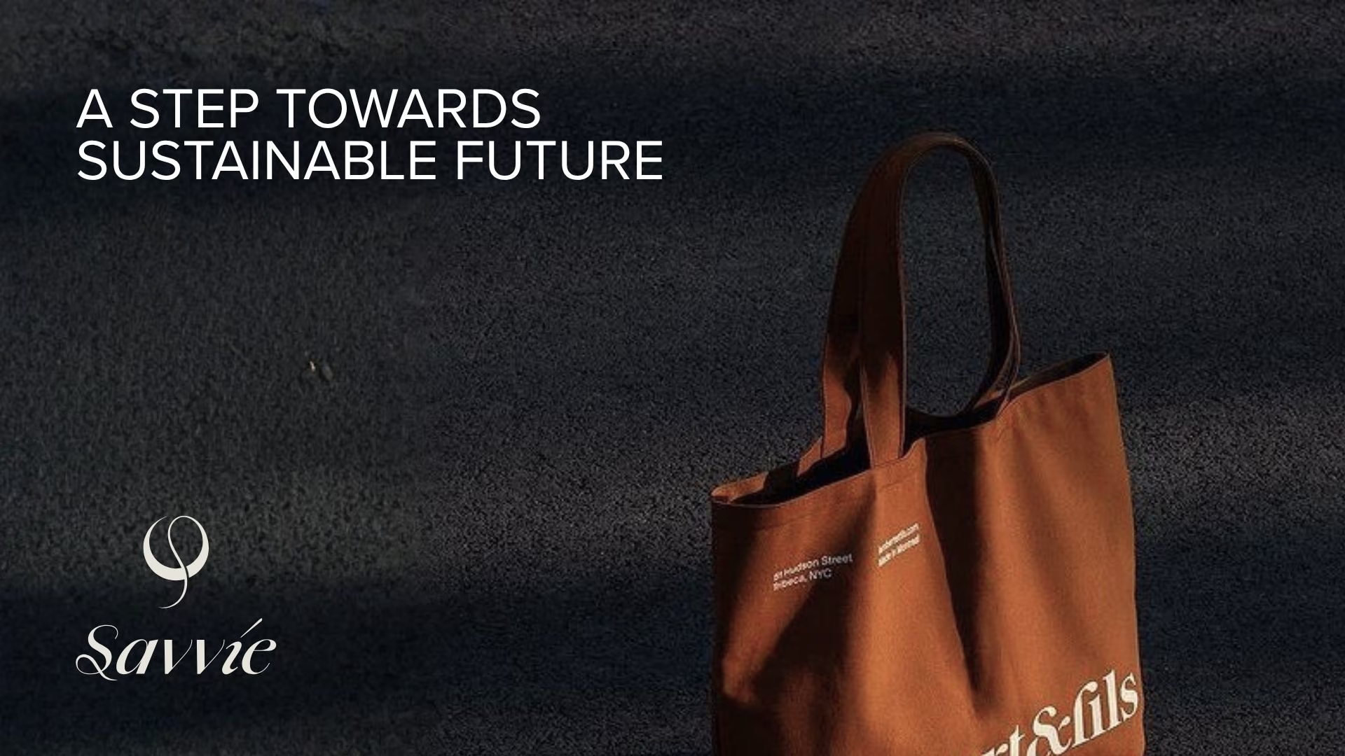
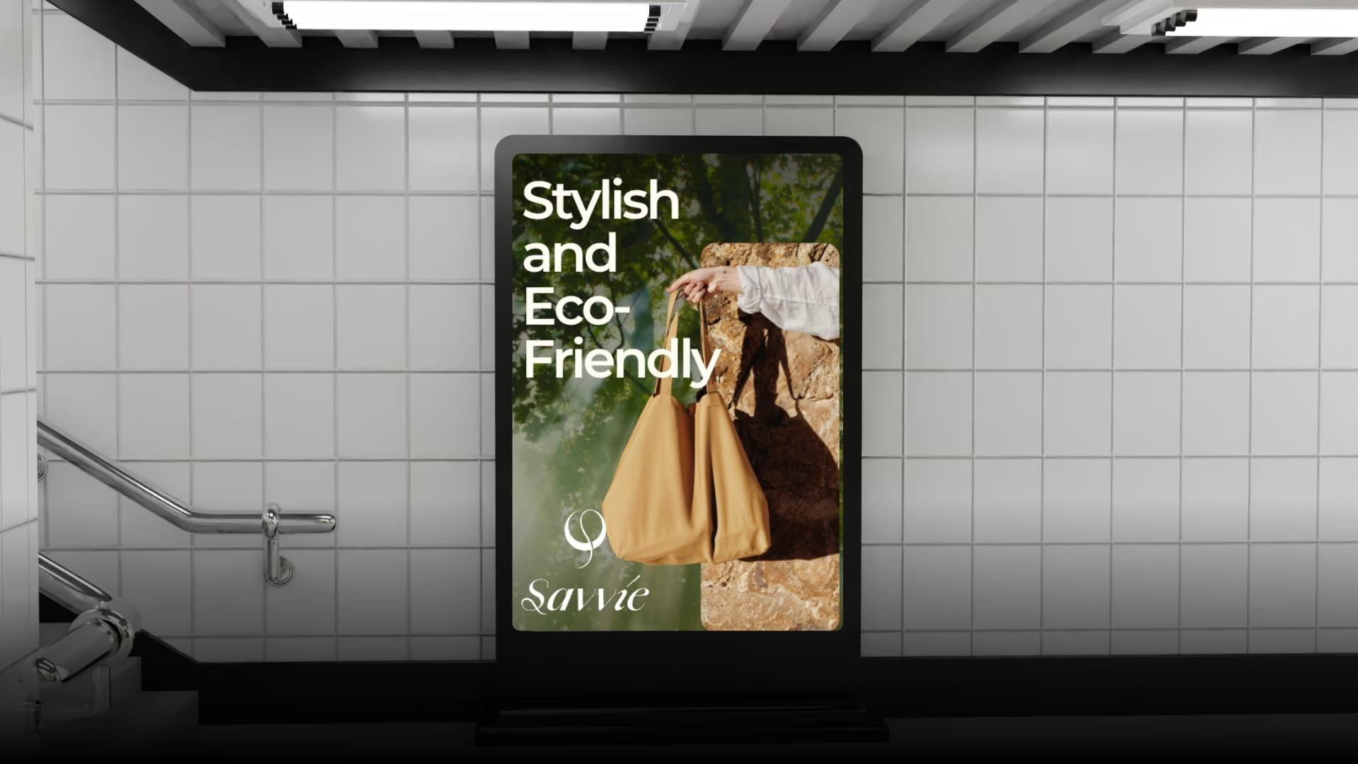
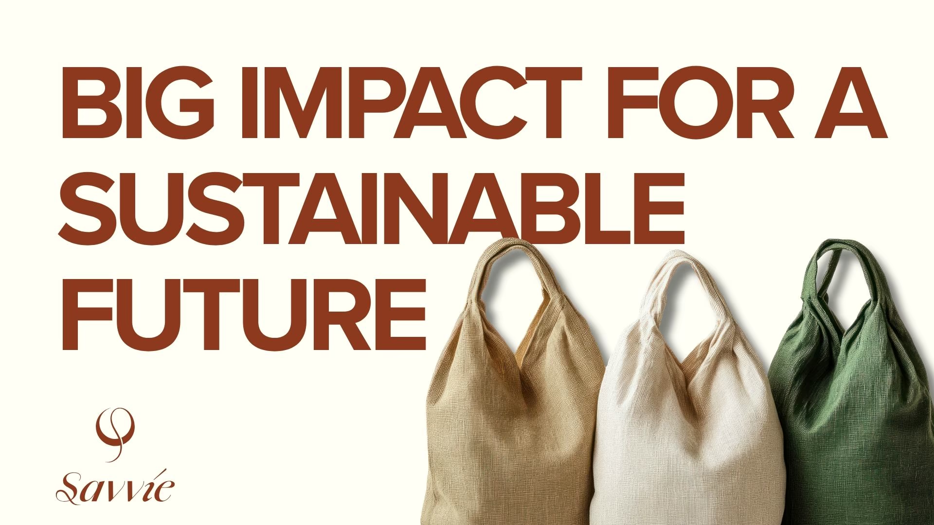
Natural textures, linen fabrics, earthy photography, and soft lighting all help reinforce the feeling of craftsmanship. The layouts are kept clean, giving the products room to stand out instead of competing with heavy graphics or unnecessary decoration.
The overall identity feels warm, honest, and approachable while still looking professional enough for corporate partnerships and large-scale wholesale orders.
The Outcome
Savvié became more than a reusable bag brand.
It became a brand businesses can confidently put their own name alongside. Every bag feels like an extension of the business that hands it to a customer, making packaging part of the overall brand experience instead of something that’s quickly forgotten.
The final identity feels timeless, thoughtful, and easy to recognize. It reflects the quality of the products, the natural materials behind them, and gives Savvié a strong foundation to grow across retail, wholesale, corporate gifting, and digital platforms.