
IDHAM is a natural skincare brand built around purity, luxury, and the healing power of plants. It began as a personal journey to soothe eczema, evolving into a full line of plant-based skin, hair, and bath care products that are vegan, cruelty-free, non-toxic, and organic
Hear from the founder:
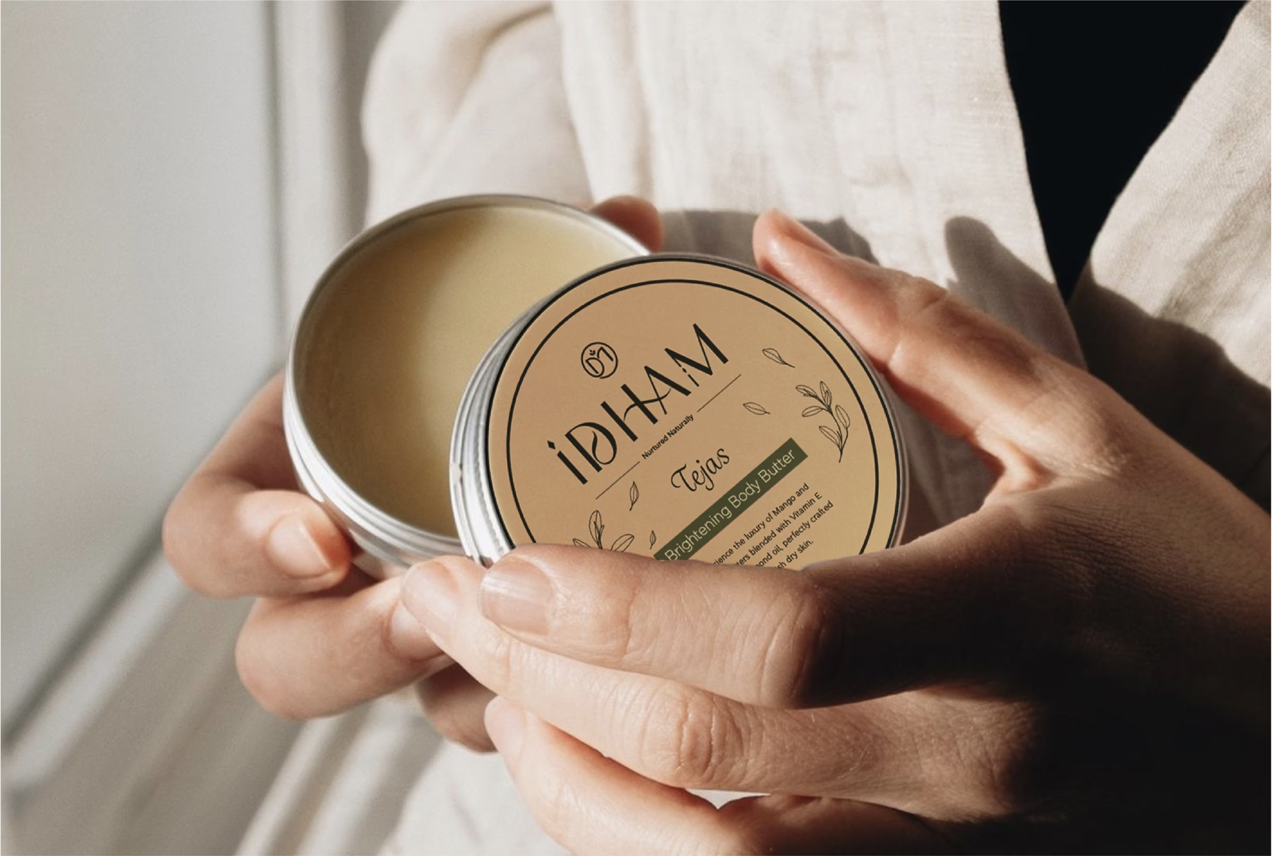
IDHAM Natural Skincare Brand
1. Understanding the Client
IDHAM approached us with a vision to establish itself as a leader in natural skincare, emphasizing purity, luxury, and the healing power of nature. They sought a brand identity that would not only embody these values but also set them apart in a competitive market.

2. Research and Strategy
Our initial research delved into understanding the natural skincare industry, consumer behavior, and emerging trends. We identified a growing demand for products that are not only effective but also ethically sourced and environmentally friendly. The strategy was to position IDHAM as a brand that offers luxury through purity, leveraging the allure of nature’s untapped beauty and efficacy.

3. Design Vision and Color Palette
The design vision for IDHAM was to encapsulate the essence of the earth and its natural beauty. This led us to choose a color palette that resonates with the brand’s core values:
- Primary Color – Ivory Sand – #FCF4DE : Symbolizes purity and a clean, fresh start.
- Secondary Color – Earthen Almond – #DFC5A6 : Represents the earthy, grounding foundation of the brand.
- Secondary – Deep Forest – #24261E : Stands for the deep, mysterious allure of nature.
- Accent Color – Rustic Terracotta – #92452F : Evokes the warmth and nurturing aspect of the earth.
- Accent Color – Olive Grove – #606644 : Reflects the brand’s commitment to natural, organic ingredients.
4. Typography
The typography chosen for IDHAM further emphasizes its brand identity:
– Contralto Medium & Rig Sans Semibold: Used for bold hero titles and secondary titles, offering a strong yet elegant presence.
– Rig Sans Regular: Selected for body copy, complementing the titles with subtlety.
– Grafolita Script: Adds a personal, handcrafted touch to secondary copy, reflecting the bespoke nature of IDHAM’s products.
5. Wordmark and Monogram Design
- The wordmark is a hand-drawn design that reflects IDHAM’s commitment to pure, herbal skincare. Diamond shapes in the design symbolize both purity and luxury, while the clean, simple sans-serif font base underscores the brand’s modern, sophisticated approach. The monogram is a testament to IDHAM’s philosophy of nurturing and natural care. Encased in a circular frame, it symbolizes gentleness and the cyclical nature of beauty and skin care. The intertwined ‘D’ and ‘M’ form a flowing spiral, accented by a small leaf to highlight the brand’s focus on natural ingredients. A modified crucible at the intersection represents the transformation of nature into nourishing skincare products.

Conclusion
The brand identity we developed for IDHAM is a harmonious blend of elegance, purity, and the inherent beauty of nature. Through thoughtful design and strategic color and typography choices, we’ve crafted an identity that not only reflects IDHAM’s values but also resonates deeply with its target audience. This case study showcases our commitment to delivering a brand identity that is both visually appealing and deeply meaningful, ensuring IDHAM stands out in the natural skincare market.
