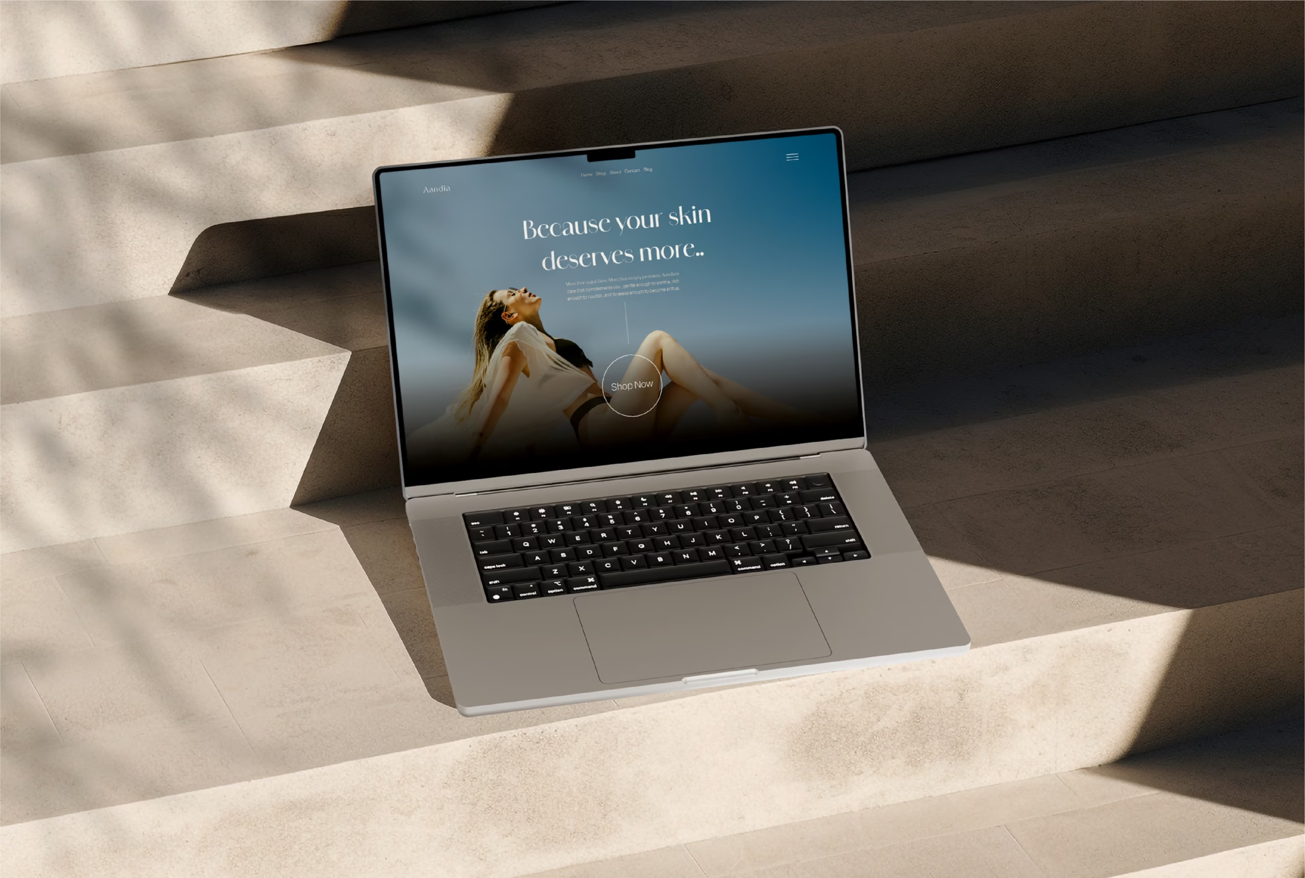
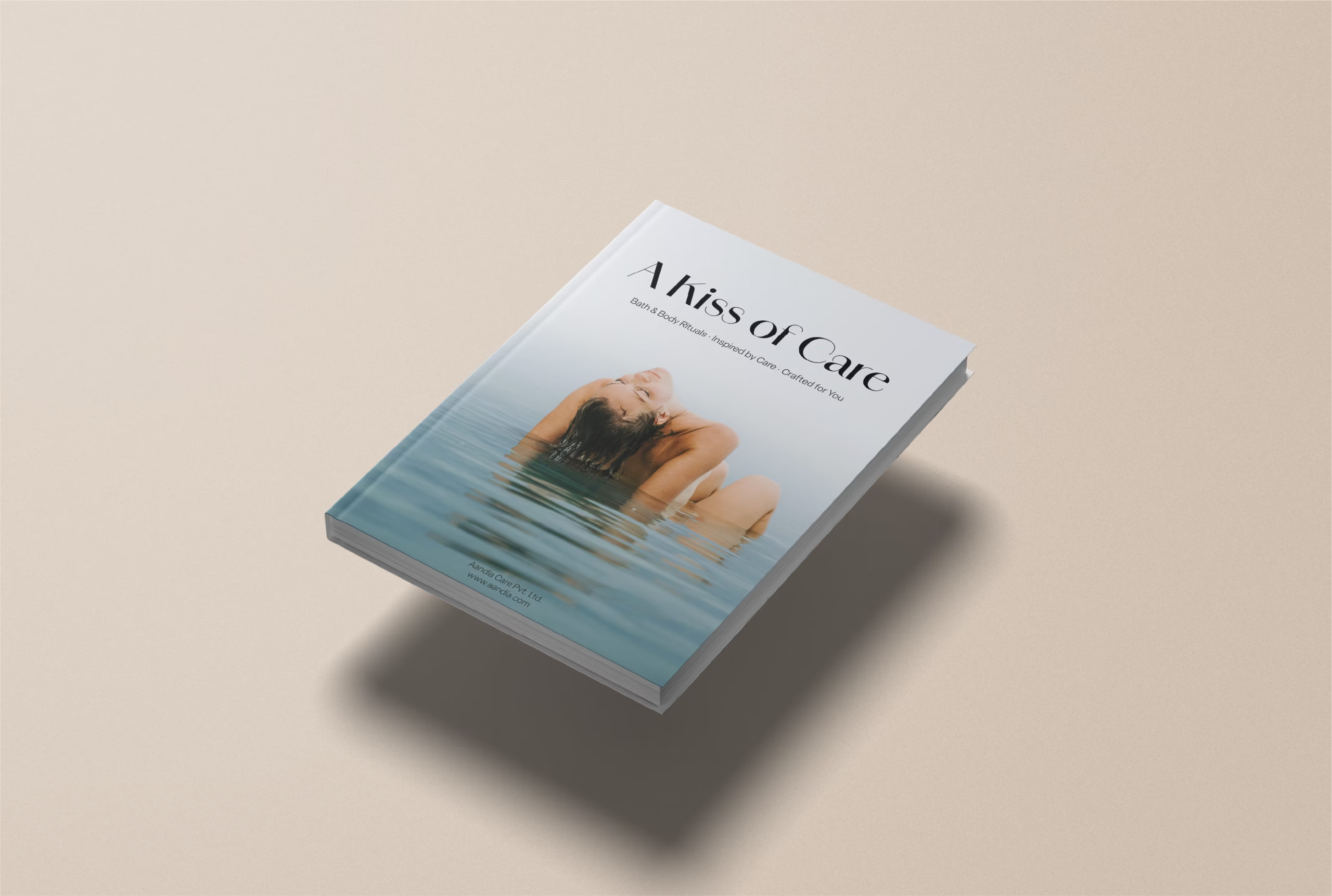
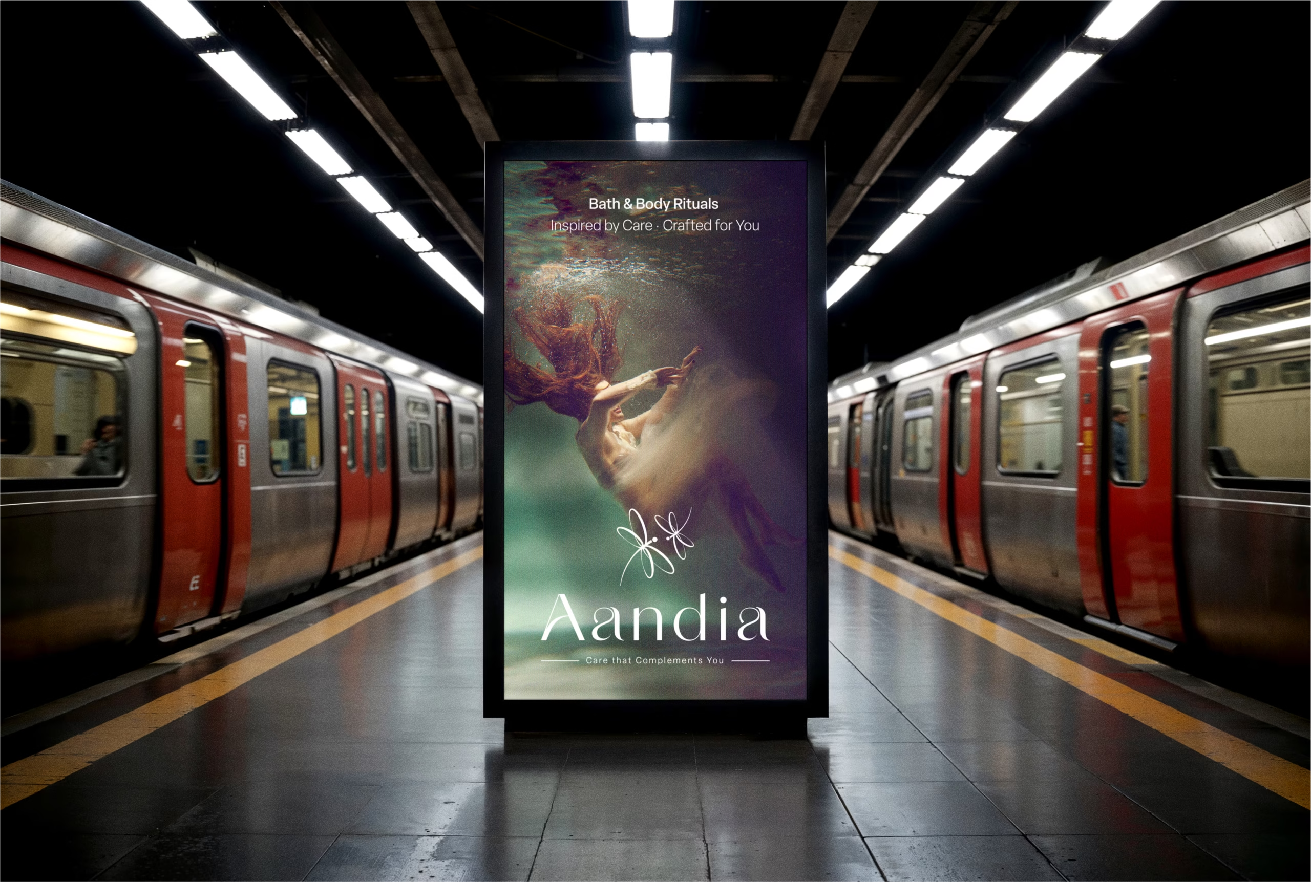
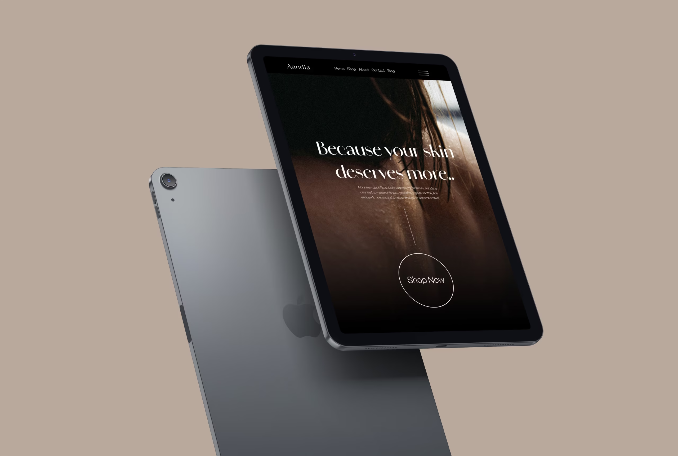
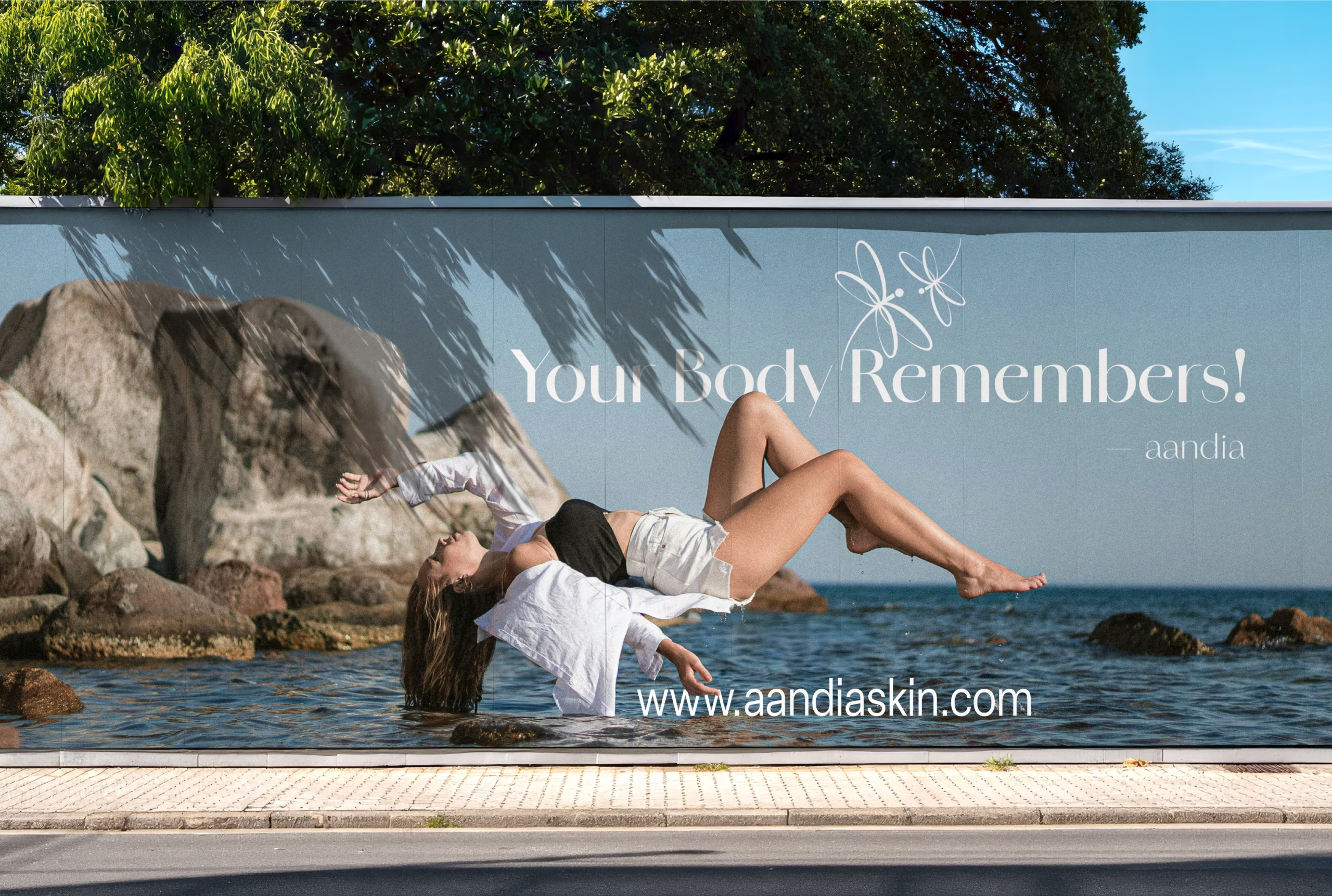
Aandia is a women-focused bath and body brand centered around “muted luxury.” That means products that feel fancy but in a subtle, soothing way. The goal? To give modern women a moment of calm and comfort that fits right into their everyday self-care routines.
Crafting a Narrative of Feminine Elegance and Care
1. Understanding the Client
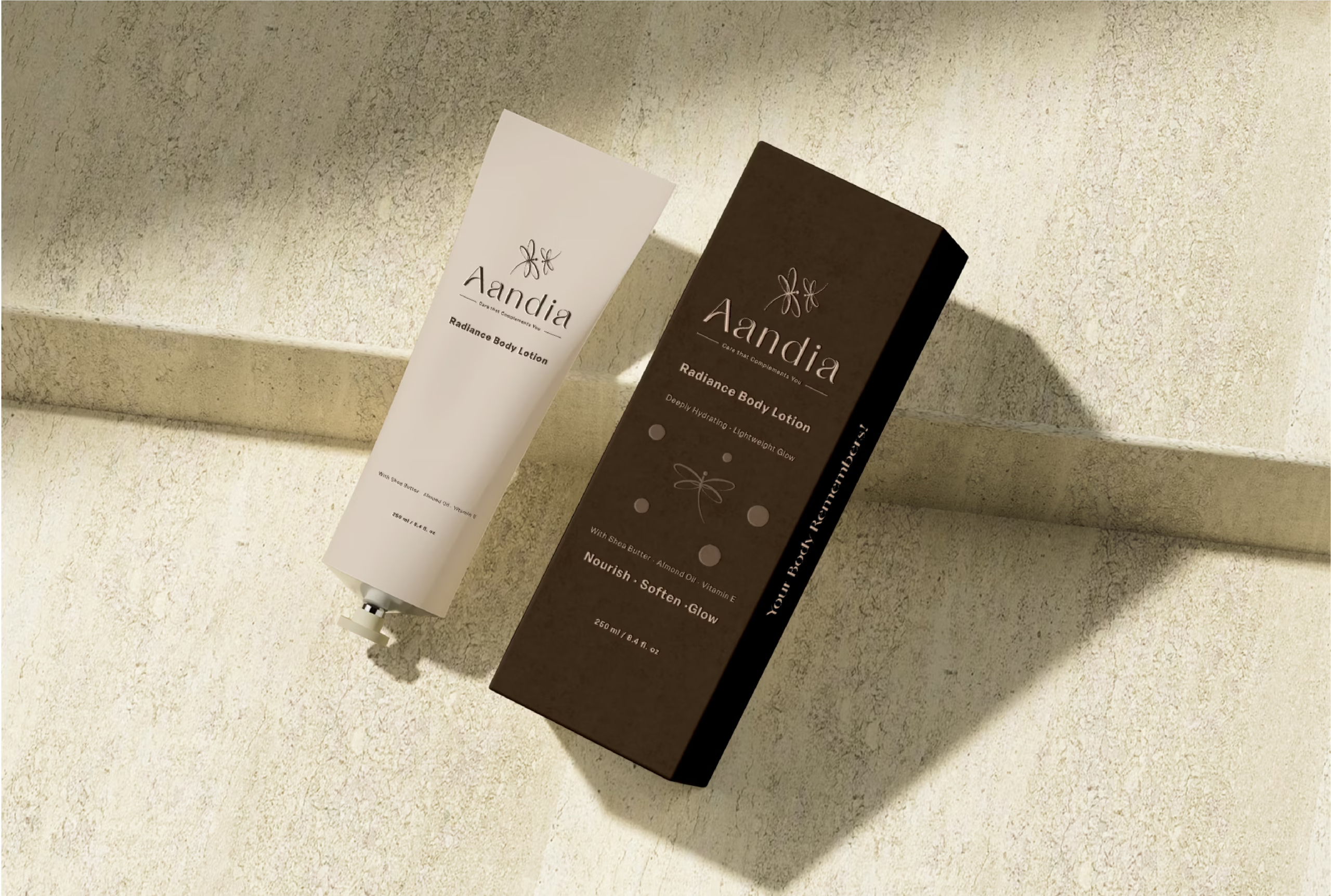
Aandia is a brand dedicated to crafting bath and body care products that epitomize muted luxury and nurturing care, specifically designed for women. The brand seeks to provide a soothing, enriching experience with products that merge quality, comfort, and an understated aesthetic, catering primarily to modern women who value both elegance and functionality in their skincare regime.
2. Research and Strategy
Our extensive market research indicated a growing demand among women for skincare products that are not only effective but also symbolically enrich their daily rituals. We delved into studies on consumer behaviour, focusing on female demographics that prioritise organic and gentle ingredients, coupled with luxurious, yet subtle, packaging. The strategy was to position Aandia as a leader in feminine care, emphasising its commitment to ingredients that respect both the skin and the environment. This approach aimed to attract a clientele that values thoughtful, conscientious consumption.
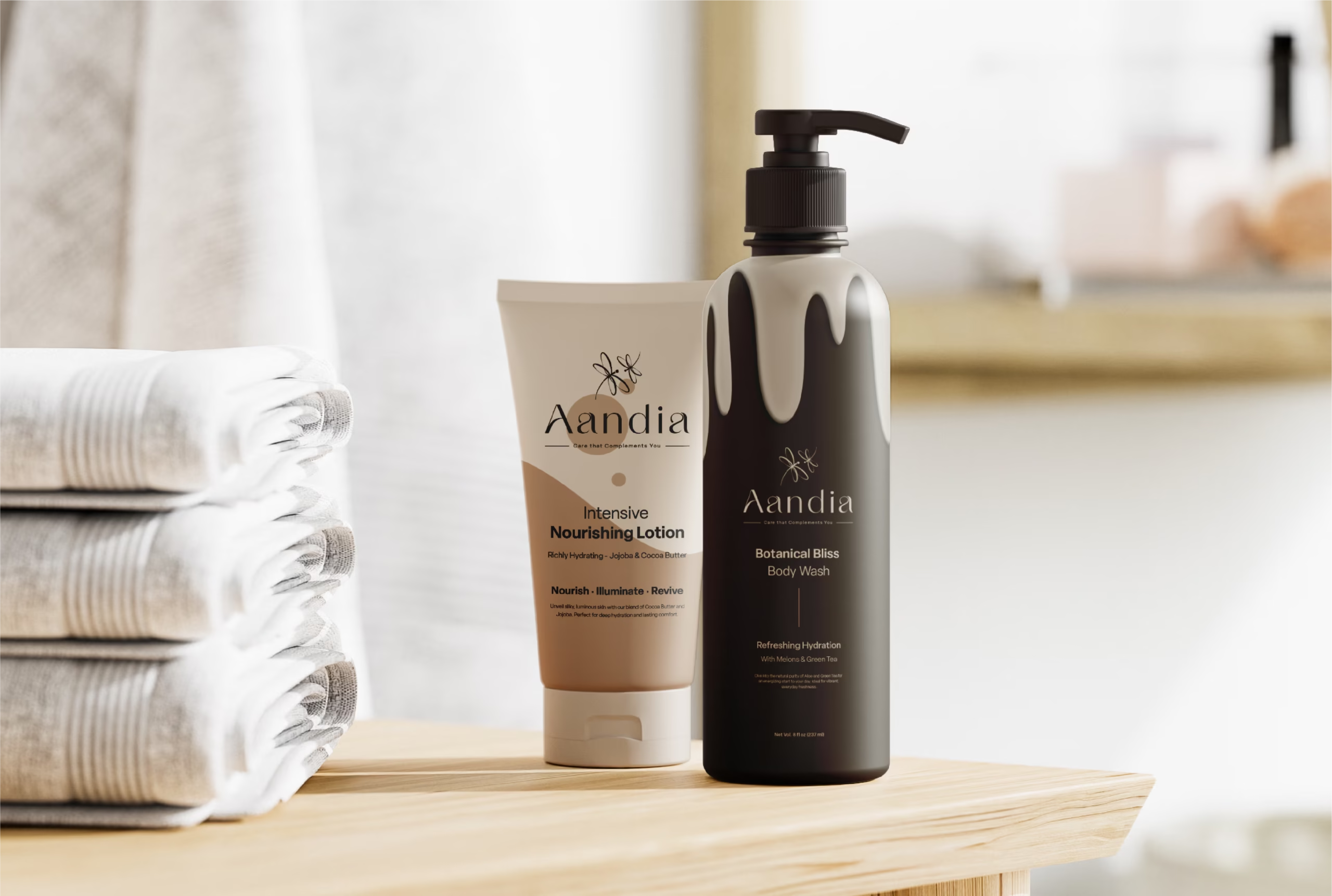
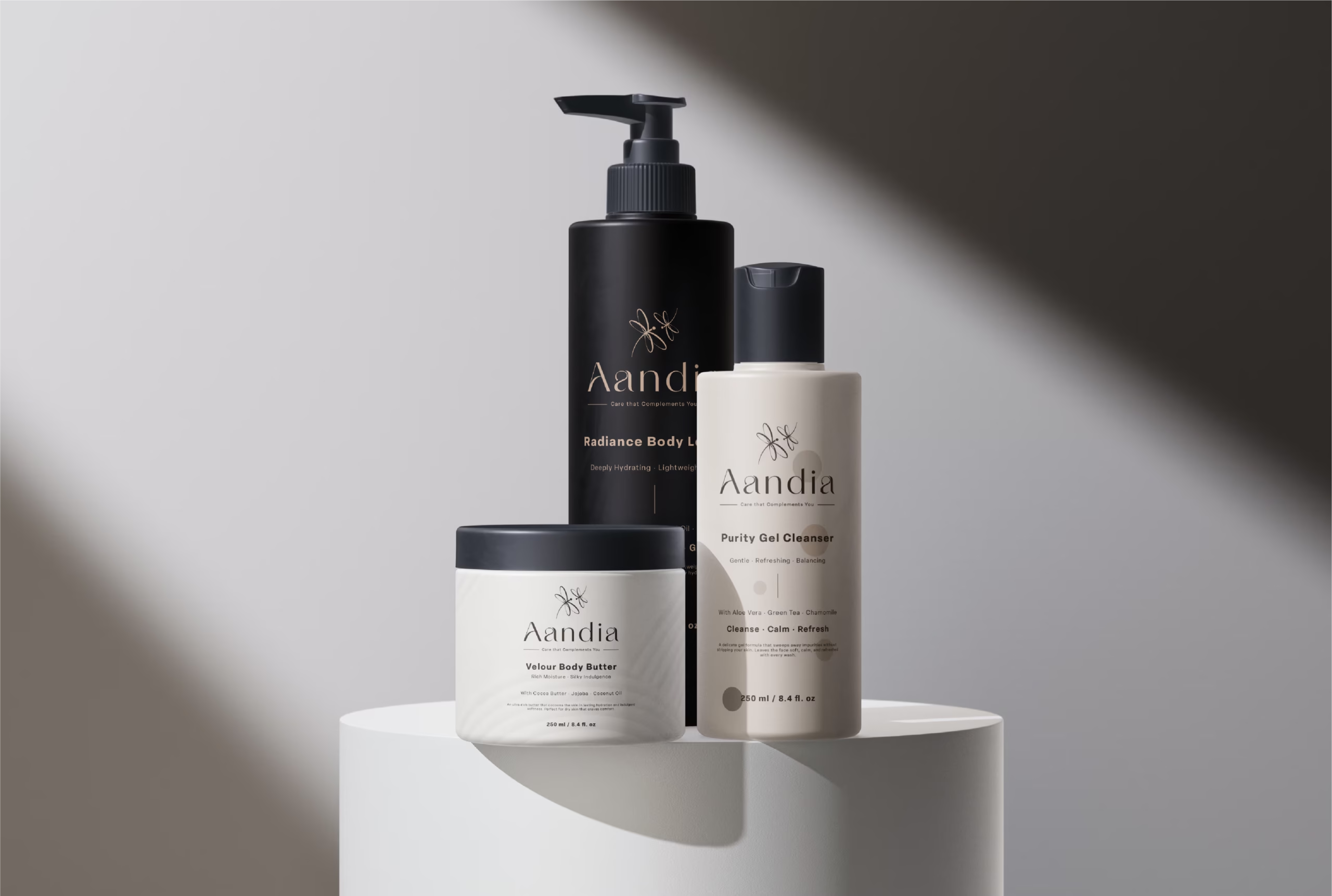
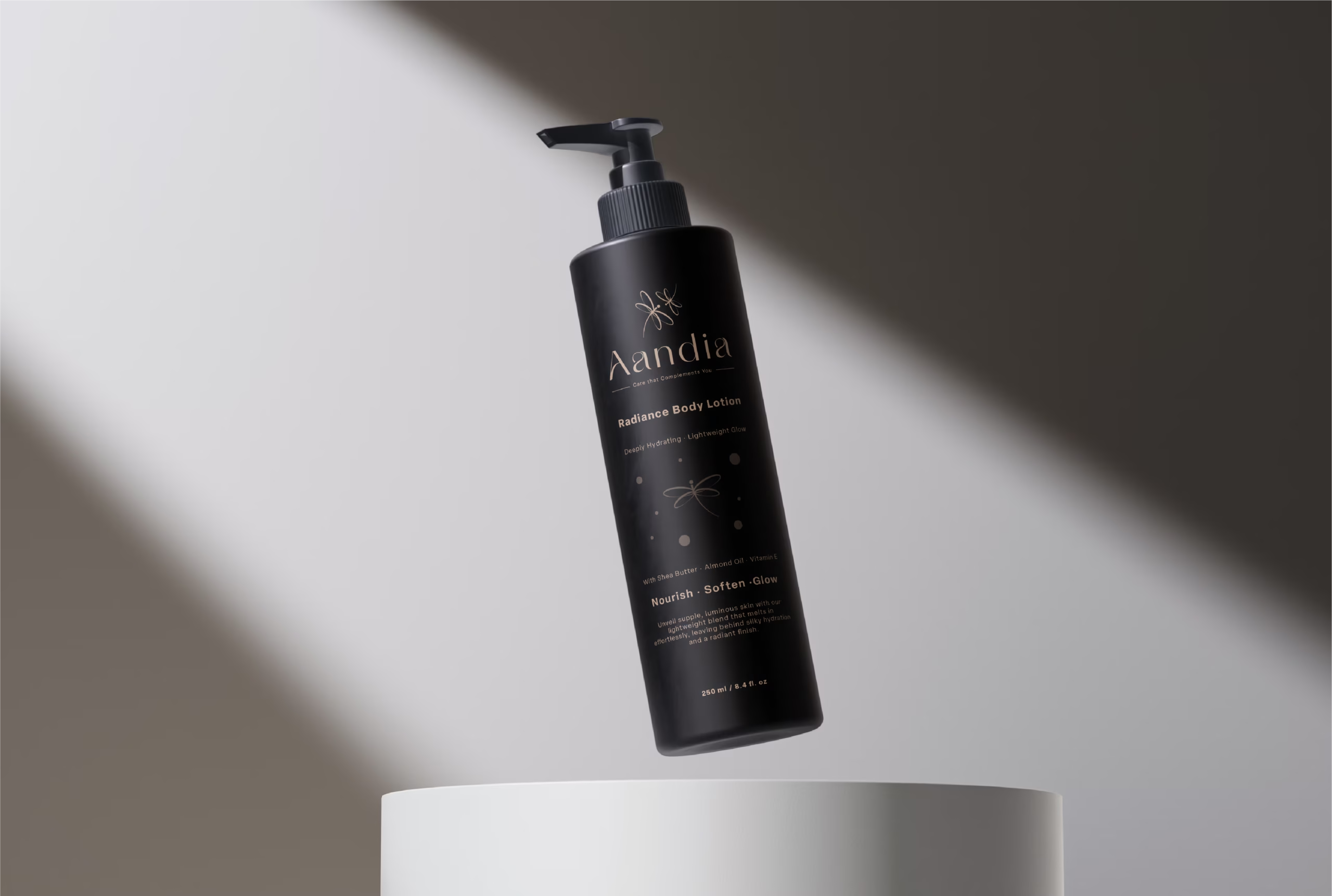
3. Design Vision and Color Palette
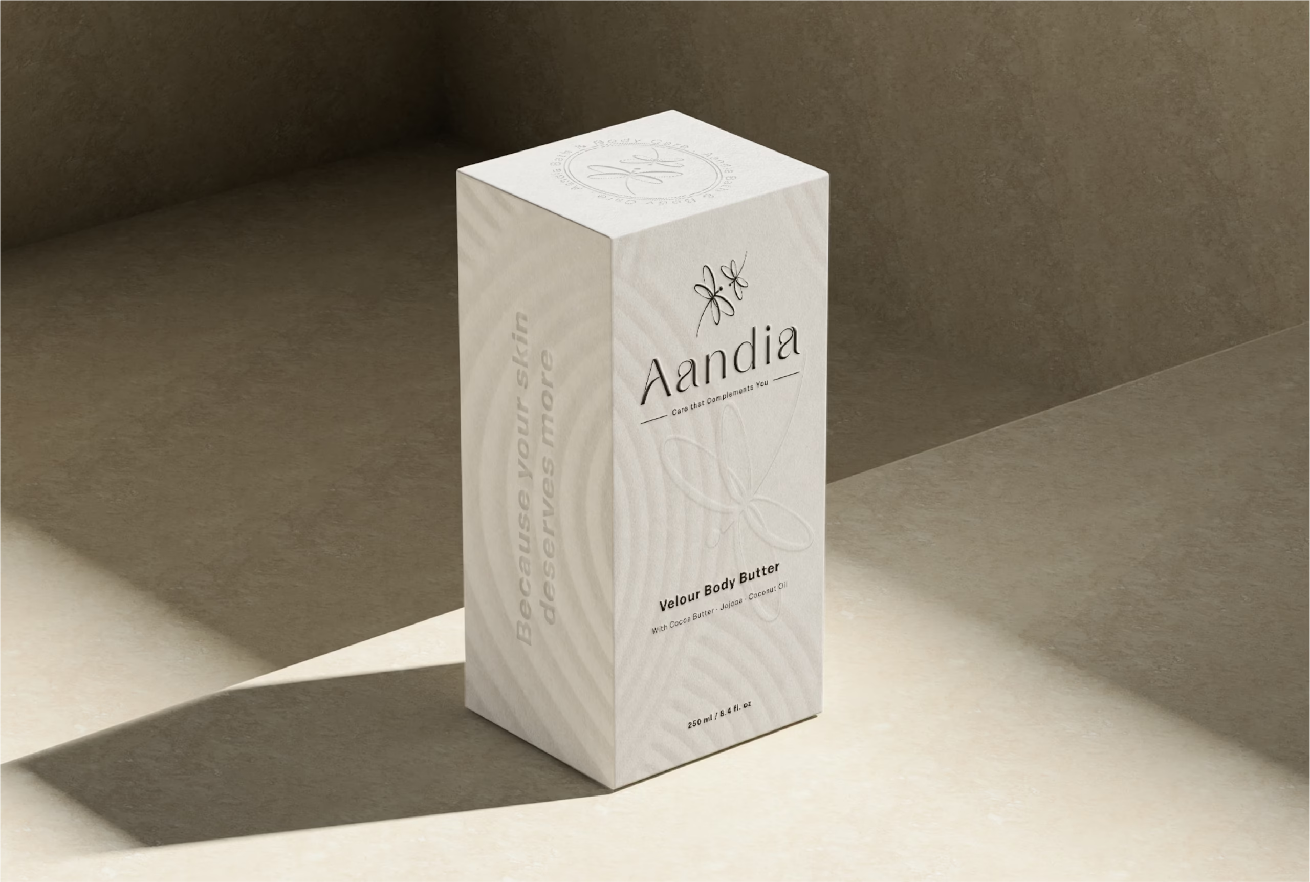
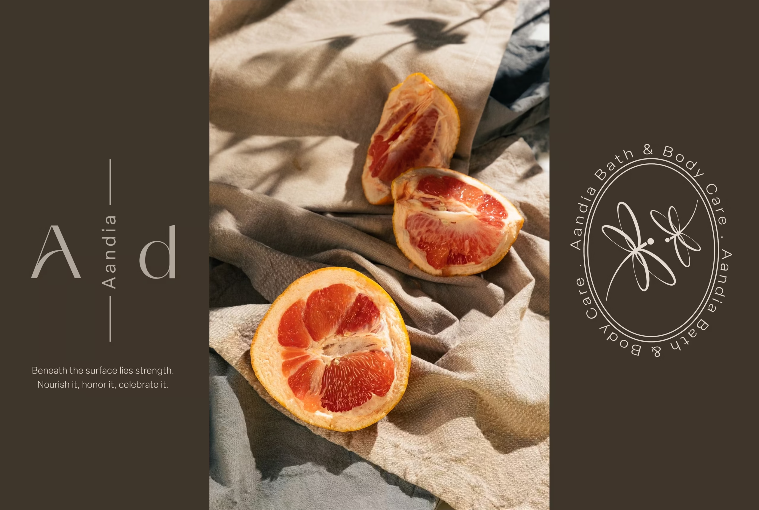
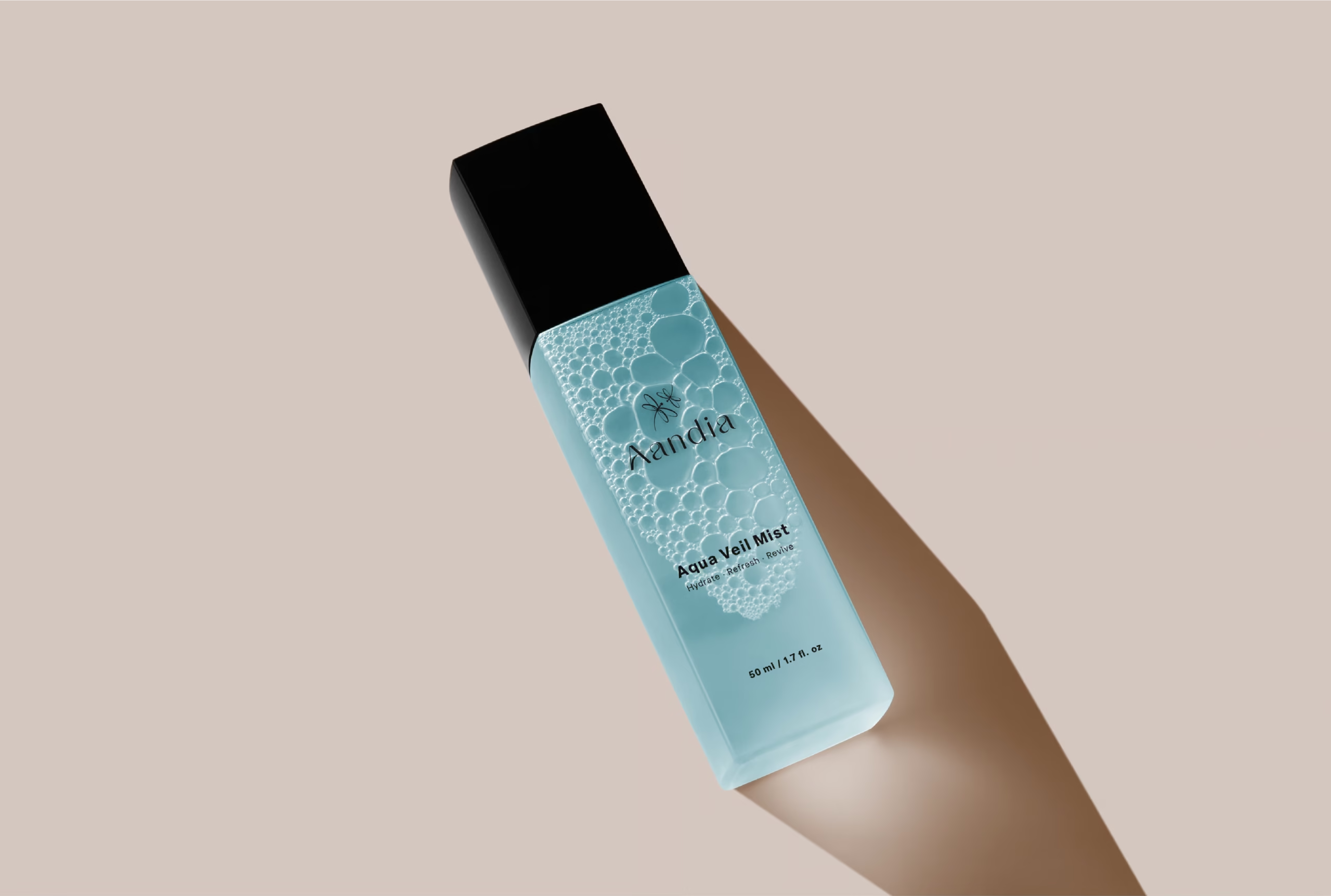
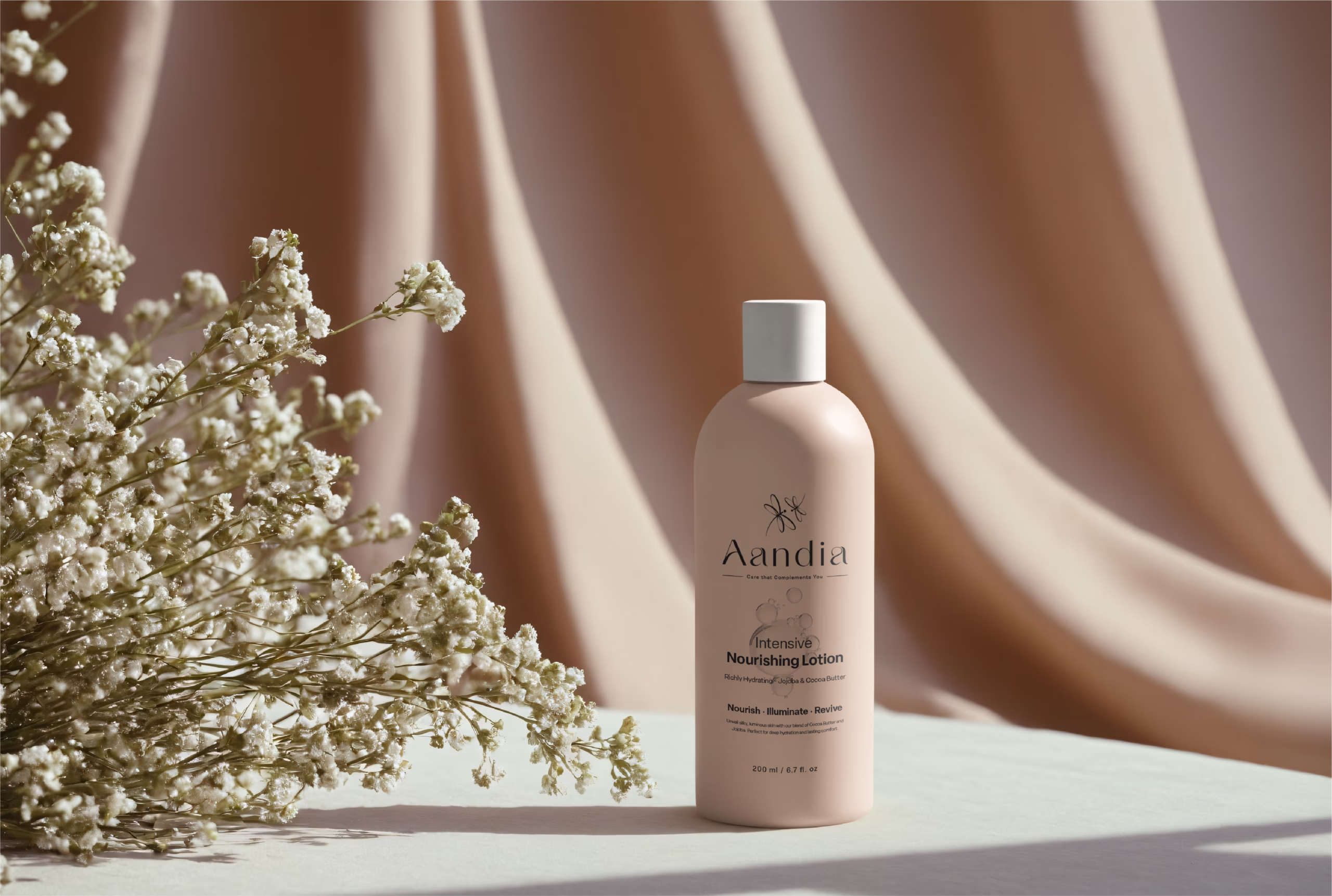
The design vision for Aandia was shaped around the concept of ‘muted luxury’, with a color palette that invokes calm and purity:
- Whisper White – #FDFCFA : A pristine base, suggesting cleanliness and simplicity.
- Soft Beige – #BCA08A : Evokes natural skin tones, suggesting warmth and comfort.
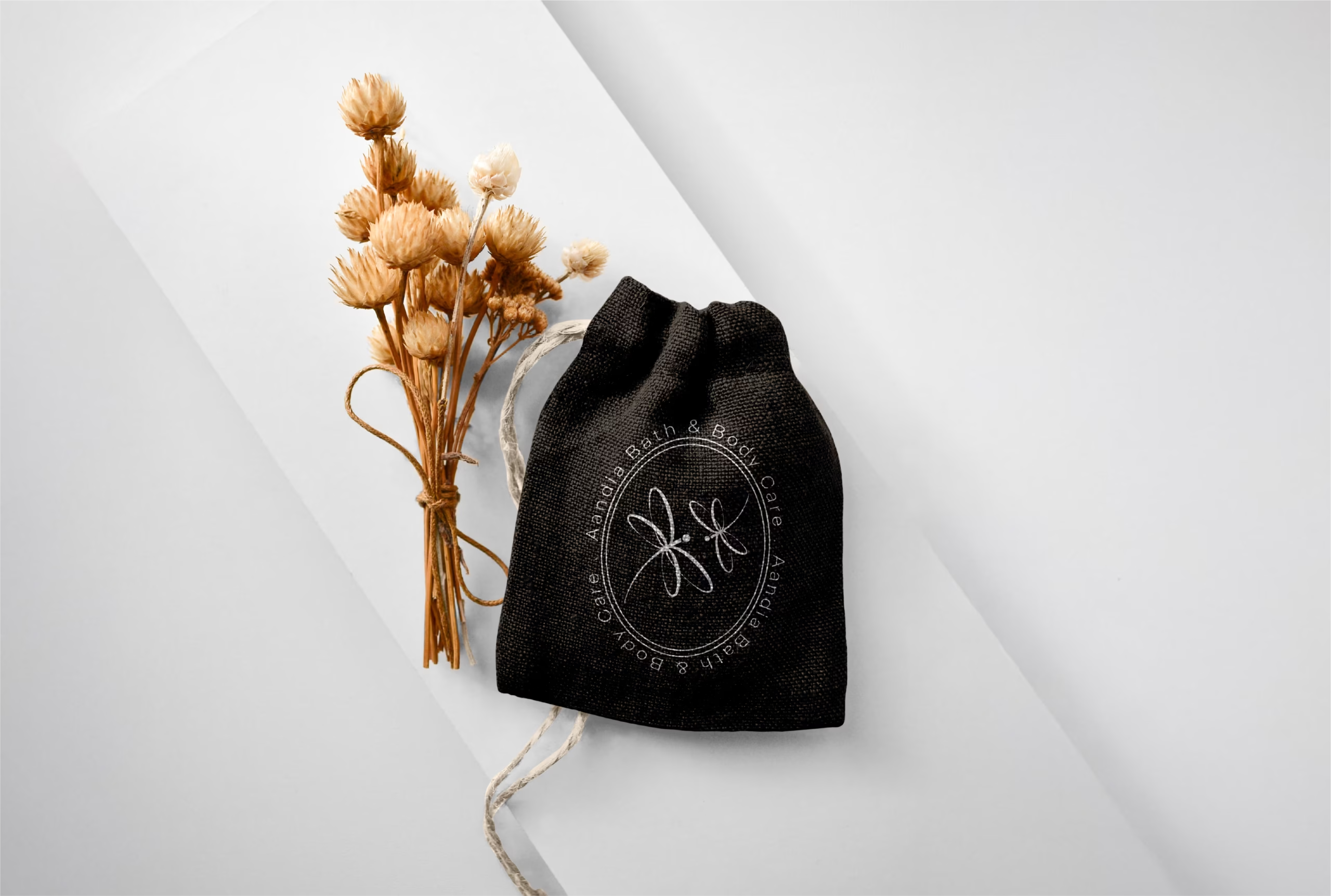
- Rich Black – #000000 : Provides sophistication and depth, anchoring the lighter shades.
- Light Grey – #E4DAD0 : Offers a modern, neutral backdrop that supports the other elements.
- Deep Taupe – #3F352B : Adds an earthy, robust accent, bringing a subtle complexity.
- Dusty Rose – #B3A79B : Introduces a feminine touch, enhancing the overall palette with its soft presence.
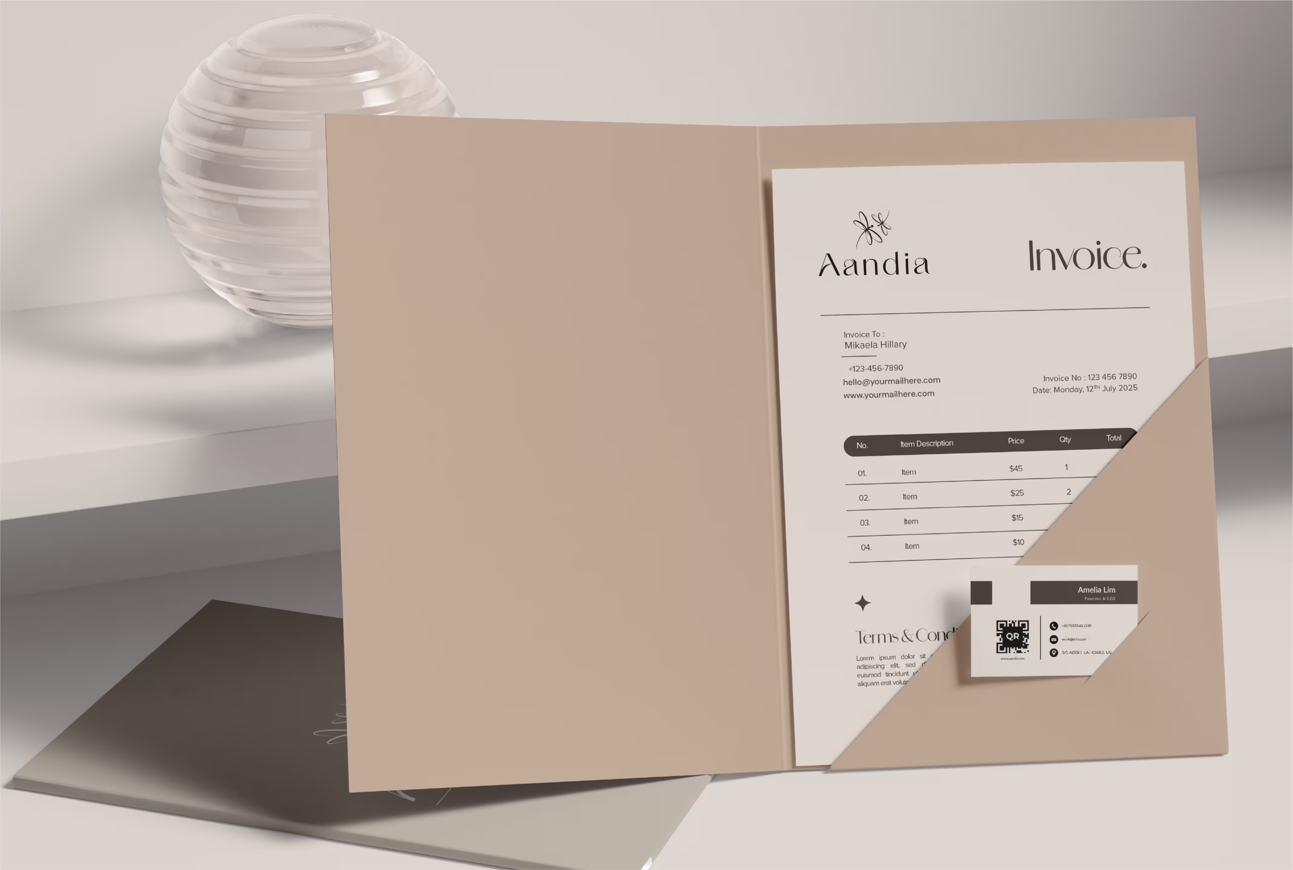
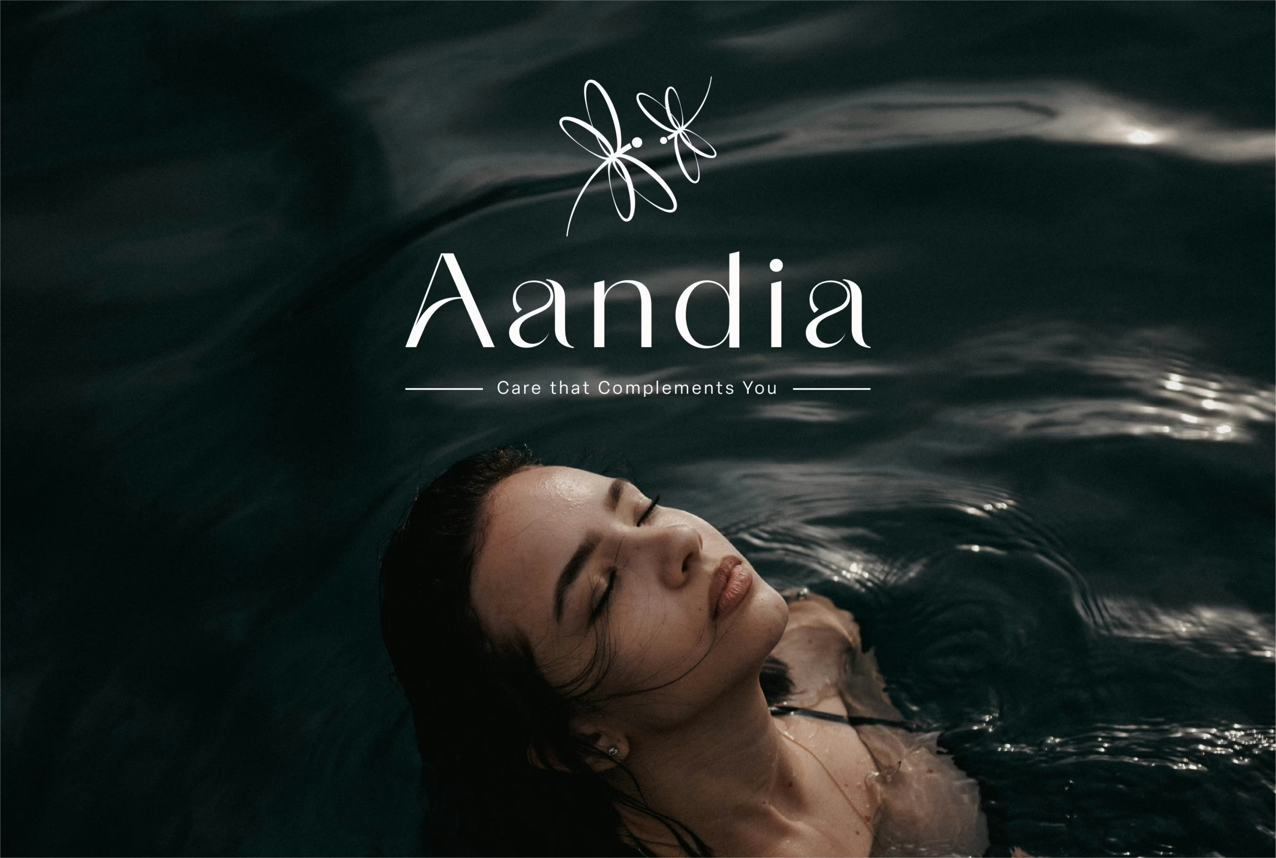
4. Typography
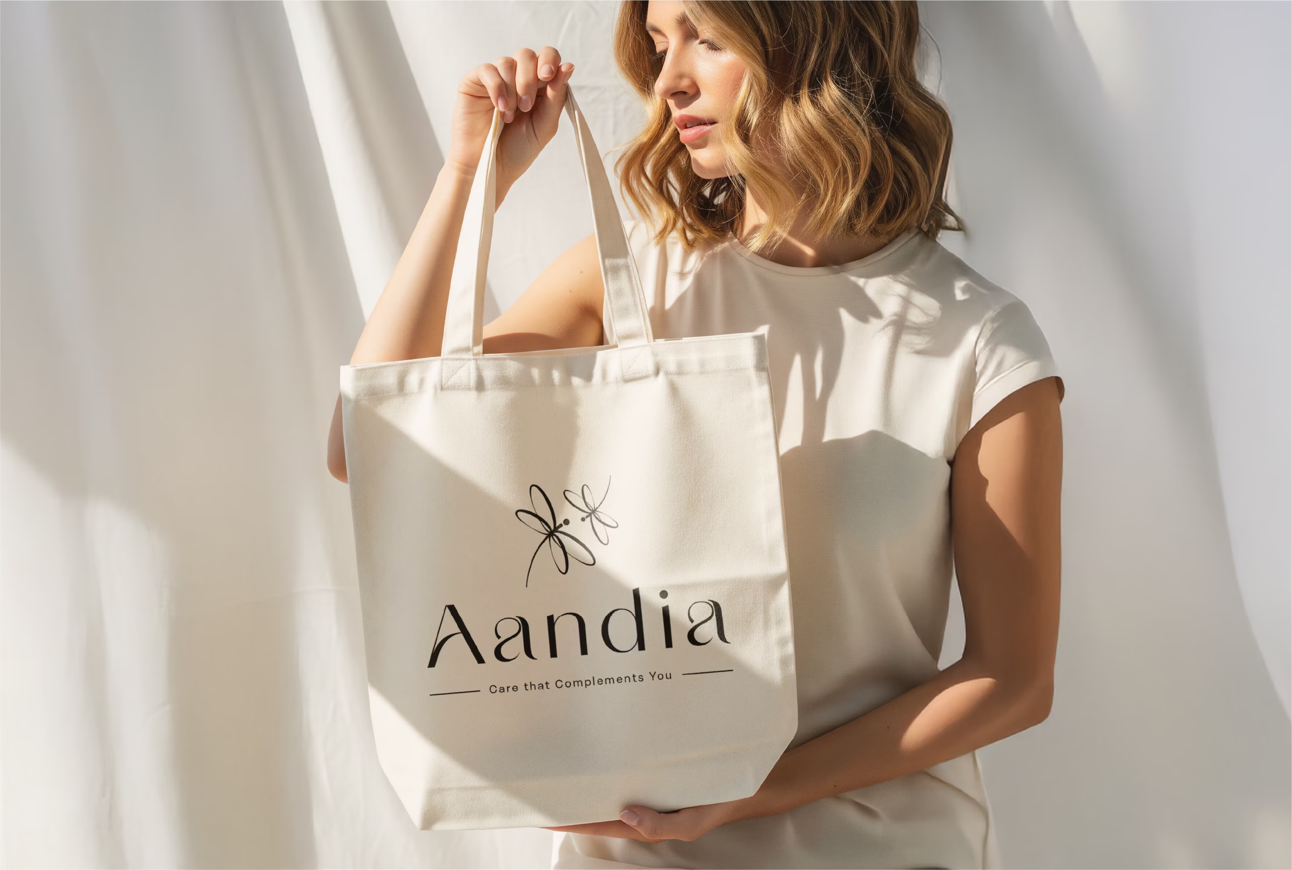
The chosen fonts, Amandine for headings and Elza for body text, enhance Aandia’s brand ethos. Amandine, with its elegant and flowing characteristics, is utilized for major headings to draw attention and convey luxury. Elza provides clarity and readability in body text, ensuring detailed product information is both accessible and aesthetically pleasing.
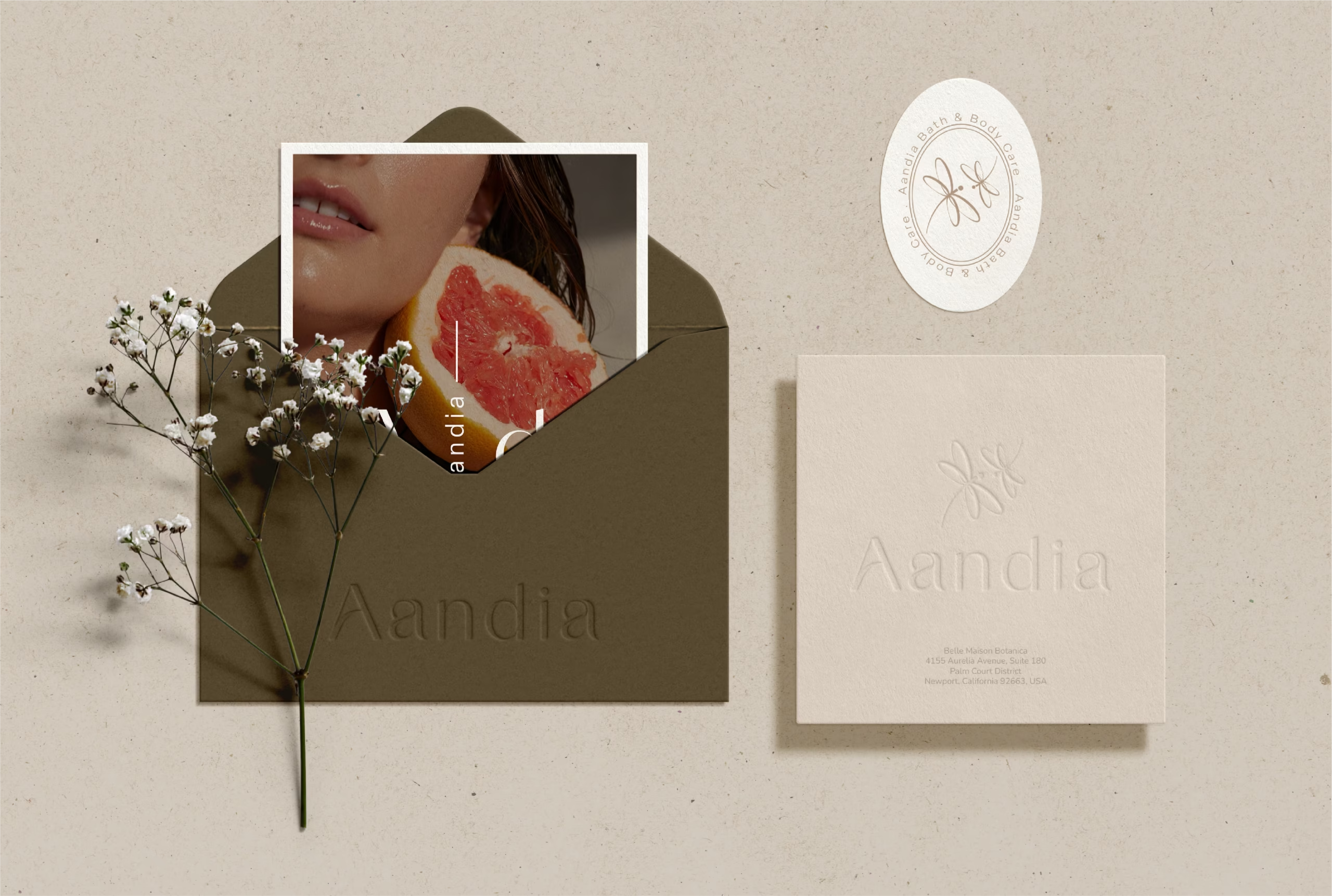
5. Logo and Brand Mark
The Aandia logo features minimalist, elegant typography accompanied by a unique graphical element that at first glance may seem floral but upon closer inspection, represents two stylized damsels. This imagery is both a nod to the brand’s focus on women and an artistic expression of femininity and grace. The damsels are depicted in a sophisticated, abstract form that communicates the brand’s focus on elegance and nurturing care.
Conclusion
Aandia stands as a paradigm of muted luxury in the bath and body care market, offering products that not only perform effectively but are also a delight to the senses. The thoughtful integration of a refined color palette, sophisticated typography, and a meaningful logo design ensures a cohesive and appealing brand identity that resonates deeply with women who seek luxury in their everyday self-care routines. This brand identity not only positions Aandia favorably in its market but also celebrates the essence of modern femininity.